Playground — an illustrated learning world for grades one to five

Playground

An illustrated learning world for the youngest grades, rebuilt from the ground up. Every screen hand-drawn, every interaction made to delight a child still finding their feet.

ROLE
Product Design Lead
COMPANY
Izzi Digital
TIMELINE
2022 - 2024
PLATFORMS
Browser App

01 Context

Its own product, built for the youngest learners

Playground is a separate product in the Izzi family, built originally for the Slovenian market and school grades one to five. It shares some skeleton data with the Izzi bookshelf, but it is its own thing, with its own audience, look, and logic. Where the bookshelf is clean and utilitarian, Playground is a fully illustrated world: every interface, button, and interactive element is custom artwork, with horizontal scrolling and a heavy focus on gamification.

When I took it over it was an early-stage product in rough shape, with no system holding it together. I rebuilt it from the ground up. Every illustration and illustrated UI element here is mine, with some backgrounds by teammates, and the animated characters supplied by the company that owns the product (insects, in Slovenia's case).

02 Problem

A charming idea trapped in a product that did not work

The concept was sound: a playful, illustrated learning world for little kids. The execution was not. The product had been built without a designer who understood interfaces, and it showed. Three problems defined the starting point.

  1. No system, and it showed everywhere

    There was no design system of any kind. Graphic assets had been made by graphic designers with no UI or UX background, so they were borderline unusable as interface. The design language was cheap-looking and inconsistent from screen to screen. Nothing shared a foundation, because there was no foundation to share.

  2. A visually led audience

    Grades one to five covers children whose reading is still finding its feet, from just-starting to fairly confident. The interface cannot lean on labels, menus, and convention the way an adult product can. It has to communicate through illustration, motion, colour, and reward first, so a young user can find their way by sight even on a rough reading day, without getting confused or giving up.

  3. Everything custom, and almost entirely on me

    A fully illustrated product is an enormous surface area. Every screen, every control, every interactive element had to be drawn, and then kept visually consistent across the whole product. Most of that work fell to one person. Consistency at that scale, by hand, was the real constraint behind every decision.

03 Work

Rebuilding the world, then filling it

The work started with the visual language itself and moved outward into the features built on top of it. Five areas covered most of it.

01 The Overhaul

A coherent illustrated language

Before any feature could be fixed, the visual foundation had to exist. I rebuilt Playground's illustrated language from scratch: a consistent style for interfaces, buttons, and interactive elements, drawn to work as UI rather than as decoration. The goal was a world that felt handmade and alive to a child, while behaving like a real system underneath, so every new screen could be built on the same footing instead of reinventing itself each time.

Design language synced through all the various components.

02 The Home

A hub optimized for visual navigation

The Playground home is the equivalent of the Bookshelf shelf, but reimagined as a place rather than a list. Content is organised by grade and class, set inside an illustrated landscape the animated characters live in. Navigation leans on imagery and horizontal scrolling instead of text, so a child picks a grade, a subject, and a game by recognising pictures, not by reading menus. It is the front door, and it had to feel like somewhere worth being.

Interface layers are distinguishable by their intention, but still follow the same design language.

Custom illustrated environments per school grade.

03 E-Gradivo

The library, rebuilt as a physical illustrated shelf

E-Gradivo is the part of Playground closest to Bookshelf: a scrollable library of learning materials, both regular and interactive PDFs. Here it is reskinned into the illustrated theme, with a physical cartoon shelf that moves vertically as the child scrolls. Same underlying job as the Bookshelf shelf, the direct route into the reading content, but dressed as a tangible object a young user can understand at a glance.

The wooden shelf scrolls vertically through the holes in the environment.

04 The Game Player

A gamified player built for momentum and reward

The game player runs Playground's interactive challenges and lessons, and it is where the gamification lives. Progress, scoring, and rewards (the clover and XP system) are woven through the experience to keep a young player moving from one challenge to the next. It was a complex thing to get right under the surface, balancing real learning content against the pacing and feedback a child needs. A variant was later built for Bookshelf, so the player ended up serving both products.

Player supporting games, interactive content, as well as basic media.

Animated characters supplied by different countries seamlessly integrate into the player.

05 Flipbook

The reader, redesigned to match the illustrated world

Playground's Flipbook is the interactive PDF reader, given a complete redesign to align with the illustrated theme rather than sitting inside it as a plain, out-of-place tool. New navigation, new controls, all redrawn to feel like part of the same world as the rest of Playground. It is the reader the Bookshelf version never had time to become, and the one I would point to as proof of what the format could be.

Main navigation up top, tools on the right, and the main content in the middle.

04 Decisions

Two calls that defined how Playground felt

Most of the rebuild was steady craft. These two shaped the product's character and how far its work could reach.

The Call

Draw everything custom instead of leaning on cheaper, faster assets

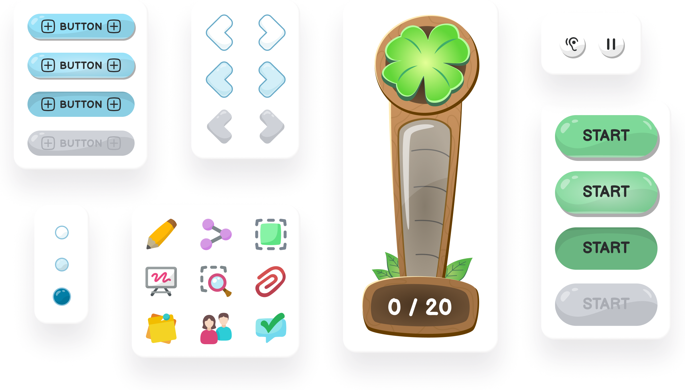
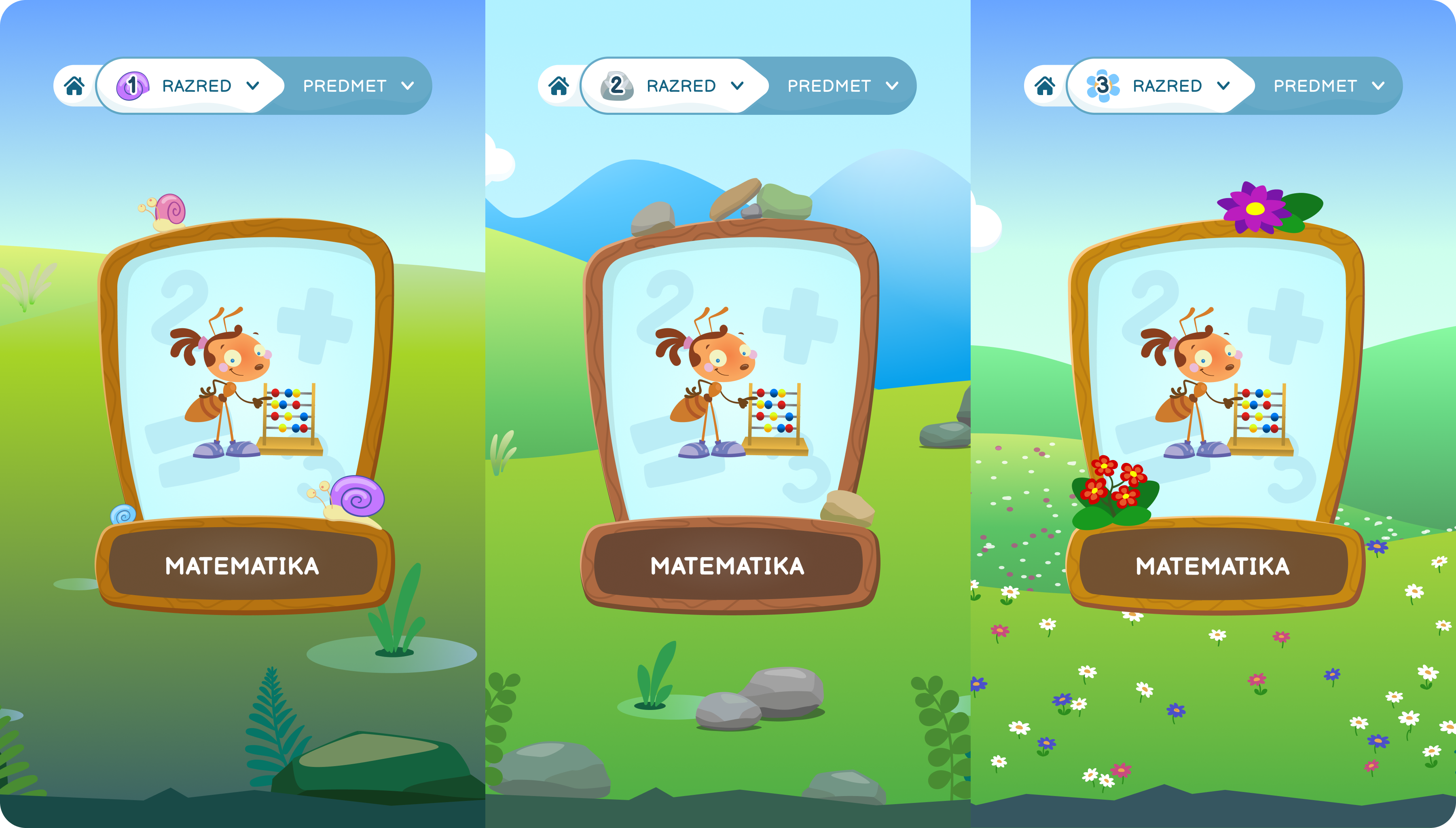
A fully hand-illustrated product is slow and expensive to make. The safer route would have been templated or stock-style assets, reused and recoloured, to cover ground quickly. The harder route was custom illustration for every screen and control, which meant far more work and a far higher bar for consistency, all resting largely on one person.

What I chose

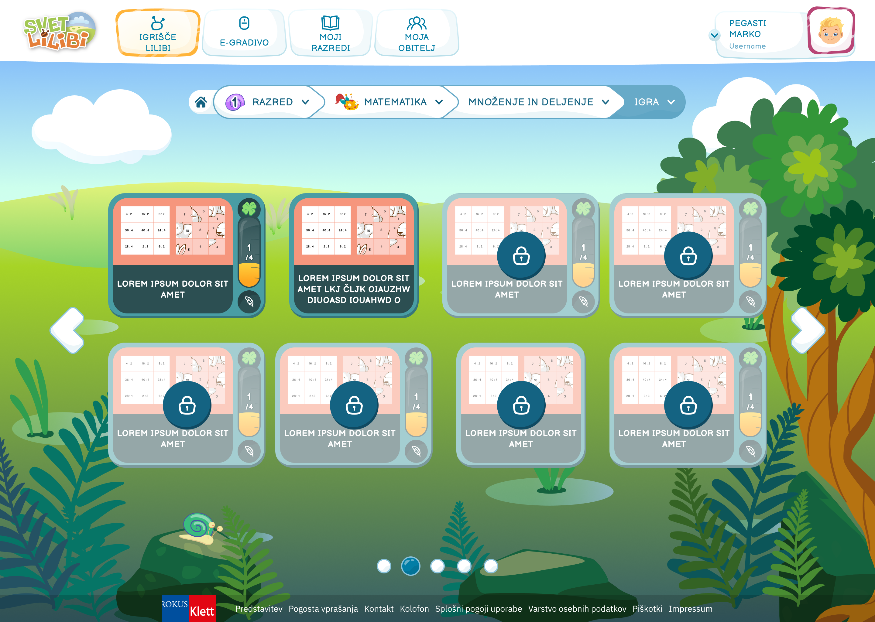
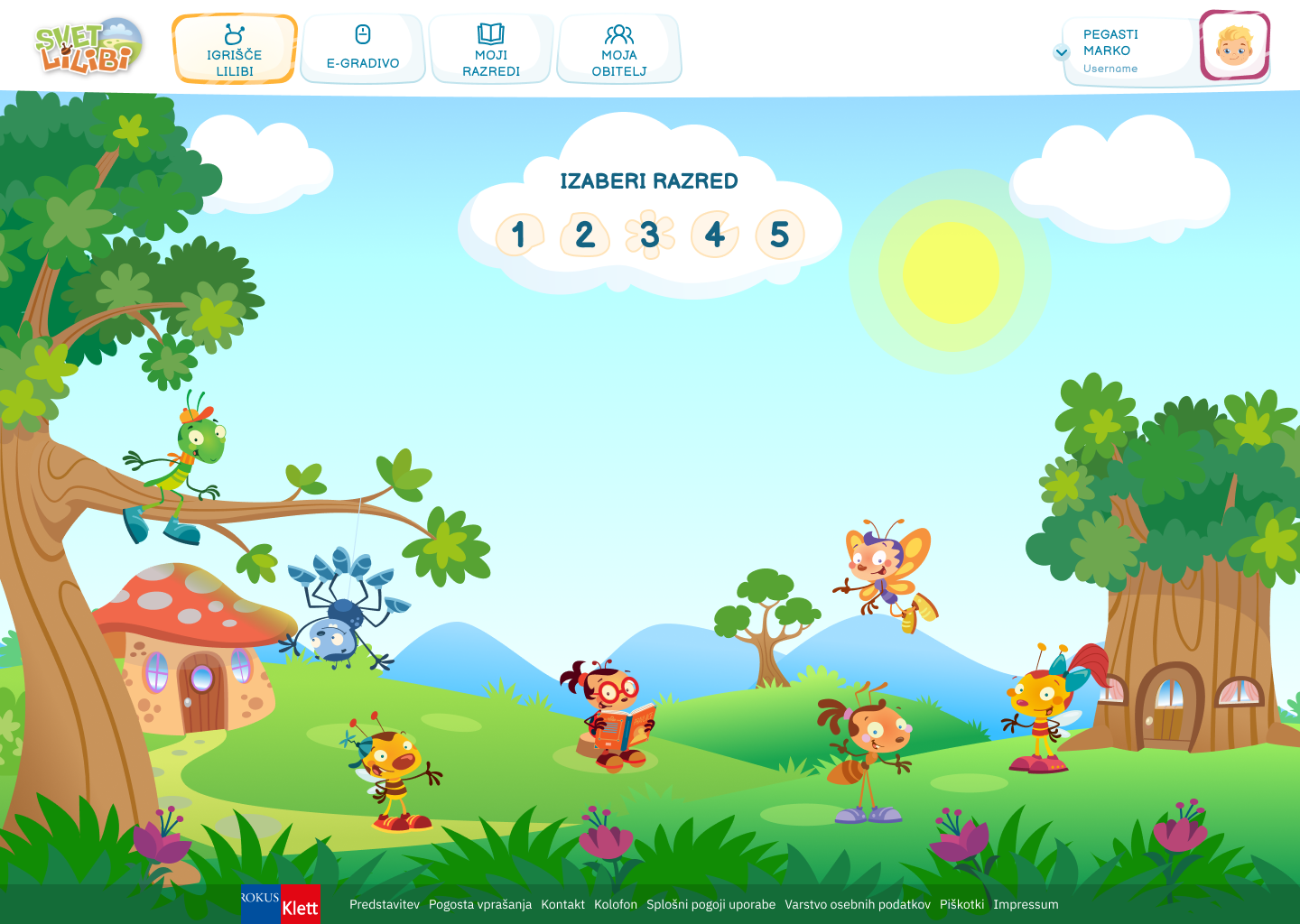
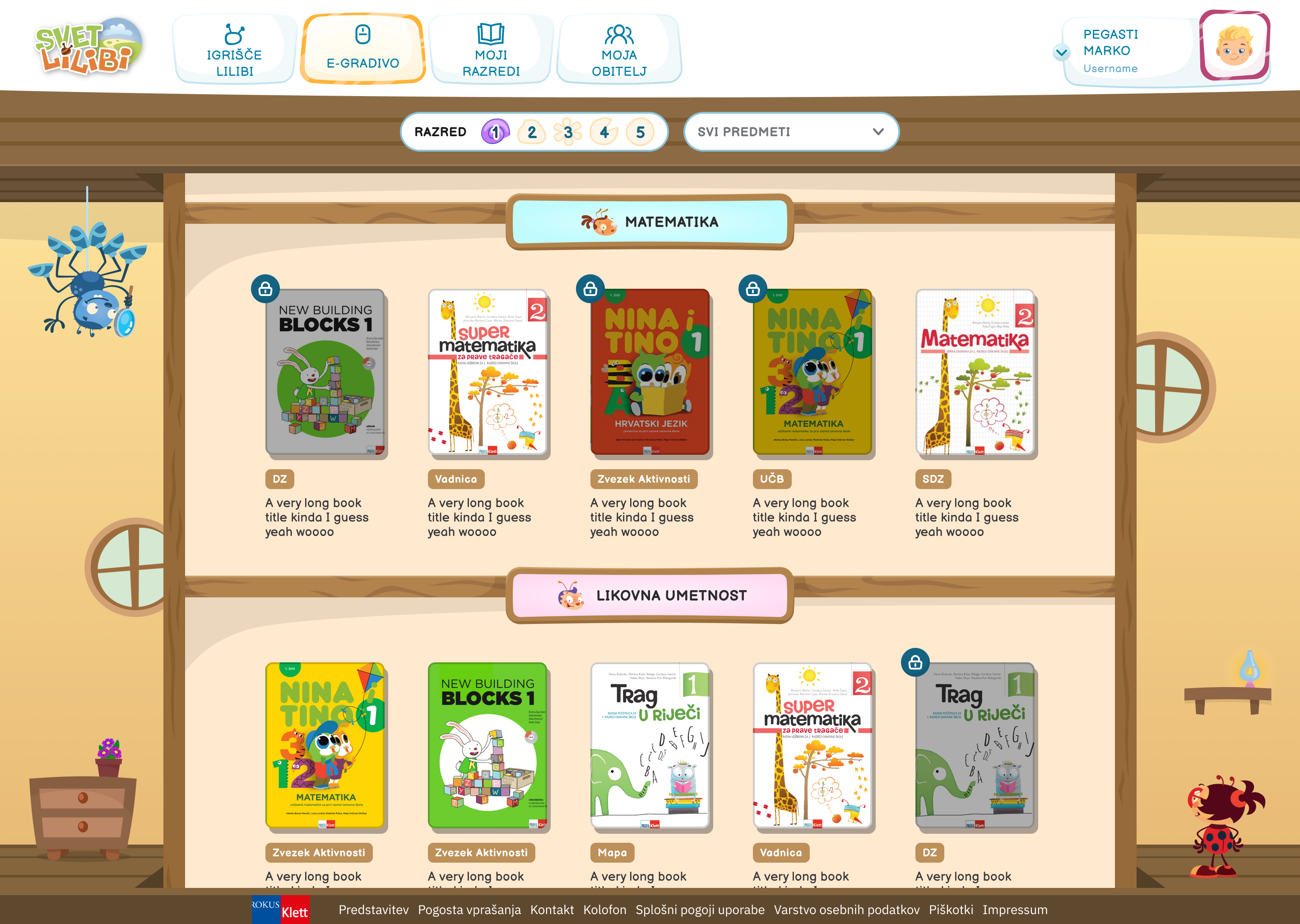
Custom, end to end. For an audience of small children, the illustrated world is not decoration, it is the interface. Cheap or generic assets would have read as exactly that, and the whole appeal of Playground rests on feeling handmade and alive. So every element got drawn, and the system existed to keep all of it coherent.

Trade-off

It was a huge amount of work for one illustrator, and it made the product slower to extend than a templated approach would have been. Worth it, because the custom world is the entire reason Playground works for the children it is built for. A generic version would have been cheaper and forgettable.

The Call

Build the game player to serve both products, not just Playground

The gamified player was designed for Playground first, where the gamification belongs naturally. The question was whether to keep it Playground-only, tightly fit to the illustrated world, or to build it so a variant could later run inside Bookshelf too, which meant designing for more than the world it was born in.

What I chose

Build it to travel. The player was structured so its interactive content, scoring, and pacing could be carried into a Bookshelf variant rather than locked to Playground. One player ended up running the interactive lessons across both products, which is a better use of the work than rebuilding it twice.

Trade-off

Designing for two homes meant the player could not lean as hard into Playground’s illustrated style as a single-product version might have. Acceptable, because a shared player meant interactive content reached students in both products from one consistent foundation, instead of two divergent ones drifting apart over time.

05 Outcome

What shipped, and what I would carry over

Playground shipped as a fully illustrated learning world for grades one to five, rebuilt from a rough, system-less starting point into something coherent across web, mobile, and desktop. The illustrated home, the E-Gradivo library, the gamified player, and the redesigned Flipbook all share one visual language, drawn to work as interface rather than decoration. It is a product a small child can navigate by sight, and one that finally held together as a system.

If I were doing it again, the thing I would protect harder is the system underneath the art. The illustrated style carried so much of the product that keeping it consistent, by hand, at that scale was a constant pull. More structure early, more reusable illustrated components, would have made every later screen faster to build and easier to keep on-style as the product grew.

5
grades, one worldBuilt for school grades one to five, the youngest learners in the suite.
1
product, rebuilt ground upTaken from a rough, system-less state to a coherent illustrated product.
100%
custom illustrated UIEvery interface, button, and interactive element drawn by hand, not templated.

More from this project

Izzi Design System

Izzi Design System

Design System

Comprehensive design system ensuring consistency across all Izzi products

View Case Study

Let's Work Together

I'm always interested in hearing about new projects and opportunities. Whether you need a design partner, want to collaborate, or just want to say hi. I'd love to connect!